Pack Like A Pro: Packaging Design Terms To Know Before You Start

Here’s the truth: Your packaging has the power to influence your audience’s decision.
Packaging takes customers on a journey. Well-designed packaging makes sure that the journey they take is the one you intended.
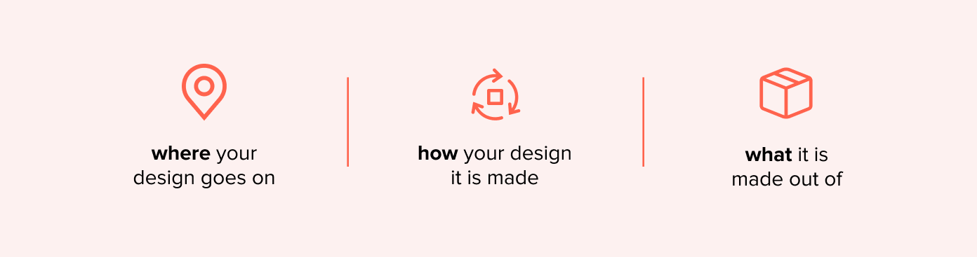
But before considering your design, you have to know three things: where your design goes on, how it’s made, and what it’s made out of. Because coming up with creative ways to package your product means knowing which parts to innovate!
So we’ve compiled the most commonly used packaging terms and jargon, and simplified it for you.
‘Cos we all gotta start somewhere, right?
Packaging Design Terms
Dieline
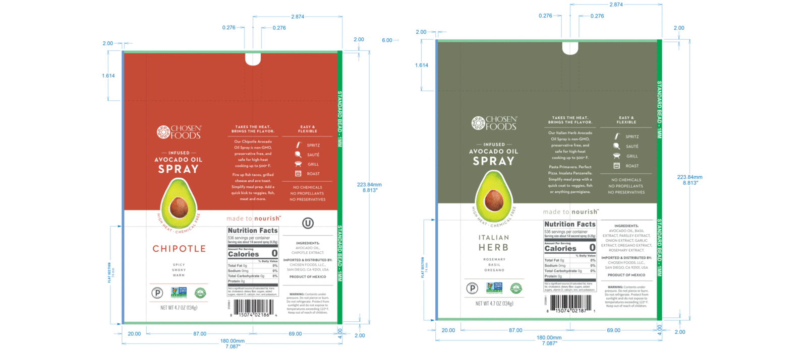
Contrary to its name, the dieline is where your packaging first comes to life.
A dieline is a template that graphic designers and printers use to understand the overall design of your packaging: from the measurements to the logo placements, folds, cuts, twists and turns, all that.
Think of it as your packaging design’s blueprint. It’s your foundation in making sure your packaging design comes out as perfect as it needs to be.
Prototype
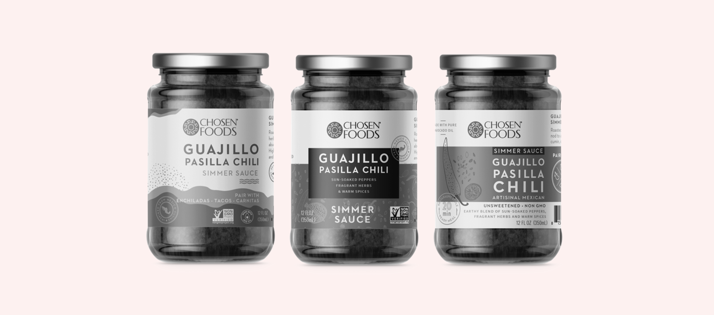
A prototype is a mock-up of your final design.
This is a sample of your design that you can hold in real-time. Not only is it fun to look at (and trust us, it is), but it also allows you to make important changes before it goes into mass production.
Having one sample of your design before mass producing saves you a lot of unnecessary spending in the process. Which is always a good thing in our book.
Shelf Appeal
At the end of the day, you want your product to stand out in stores. But your competitors know this, too.
Shelf appeal is all about having product packaging that is striking enough to make your brand stand out over competitors sharing the same shelf as you.
You want your audience to see your product, engage with it the longest, and eventually take it home.
Remember, the clock is ticking!
It only takes a few seconds for a customer to decide which product they’ll interact with, and having good shelf appeal makes those seconds count.
Pantone Matching System: PMS

*Image Credit: Cien Chiles
Your perception of the color red might be different from someone else’s red. Some might not even see red at all!
Good thing we have machines for that.
The Pantone Matching System (PMS) is a standardized system of around 5,000 colors, all organized and labelled accordingly.
Designers use PMS to pinpoint which exact color they want to use, and printers look up and use the exact PMS code for printing.
So your favorite shade of periwinkle? That specific shade of taupe? PMS has got it covered.
Bleed
Don’t panic, it’s not as scary as it sounds.
In printing, the bleed is the part of the artwork that extends beyond the cutting line. Basically, it’s the part of the artwork that gets cut off.
It might sound like a waste of artwork, but it’s actually a good way to get professional-looking packaging design. Without it, you might end up having a thin white border around your design after trimming the excess off.
Having a bleed ensures that your packaging is neat across all edges by having your artwork printed beyond the area to be trimmed off.
Only in this case could we say: the more you get used to bleeding, the better!
PDP: Principal Display Panel
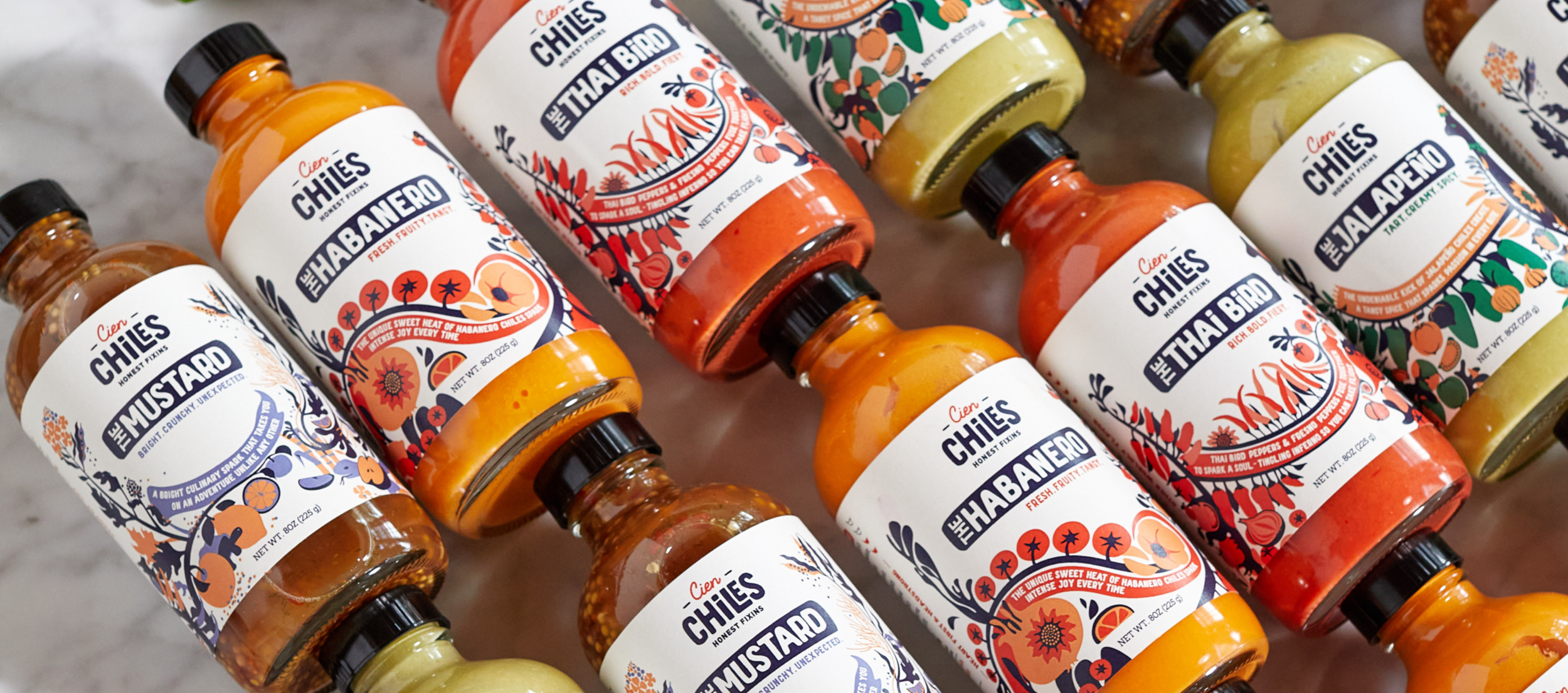
*Image Credit: Cien Chiles
When walking in a store aisle, notice how all brand names are facing toward you?
This part of the packaging is called the Principal Display Panel. It’s the part of your packaging design that consumers see when they shop, and could very well be the reason they pick up your product in the first place.
There are a few regulations on the PDP. But basically, it should include the name of your product, key facts about nutrition value, the quantity of the product, and other details.
Information overload? With proper design techniques, your PDP could still look striking and aesthetically pleasing, without compromising the necessary components.
UPC: Universal Product Code
We’re all familiar with the black and white barcode found on every product. This is the UPC: special code assigned to a product, and gets scanned and identified at checkout.
You can either have your UPC attached to your packaging, or incorporate it in your actual design. Either way, it should be placed in an area that allows it to be scanned properly.
No one likes to be held in line at the store, so don’t make your product the cause for that. Make your packaging design a cash register’s favorite!
SKU: Stock Keeping Unit
The Stock Keeping Unit is an identification code used by retailers to keep track of their stock and inventory.
If this sounds similar to the UPC, that’s because it is.
The UPC is a code meant for stores at checkout. The SKU is a similar code, but used in warehouses and the back-end of retail stores. The SKU is found in the same area as your product’s UPC, so keep this in mind with designing around your product’s code as well.

Primary Packaging
When you go around the store, what does the chip aisle look like? How about the cereal aisle? Canned goods?
What you are probably picturing is primary packaging. This is the first layer outside your actual product: a bag of chips, a box of crayons, a soda can, and the like.
But not all primary packaging is seen on the outside.
Since it is meant to be the first layer of protection, this is the last layer the consumer touches before consuming your product. It could be the wrapper around a bar of soap, or the carton protecting a dozen eggs.
Your primary packaging also includes your branding, so make sure it’s both clear and engaging enough to be picked off the shelf.
Secondary Packaging
A lot can happen to your primary packaging as it goes around from warehouse to stores.
So you should have a protective layer around the primary packaging, AKA the secondary packaging. Think of the cases that hold soda bottles, the boxes around pills and vitamins, and the like.
This is an extra and required layer of packaging during product distribution. Once your packages hit the shelves, they’re ready to flaunt your product in mint condition.
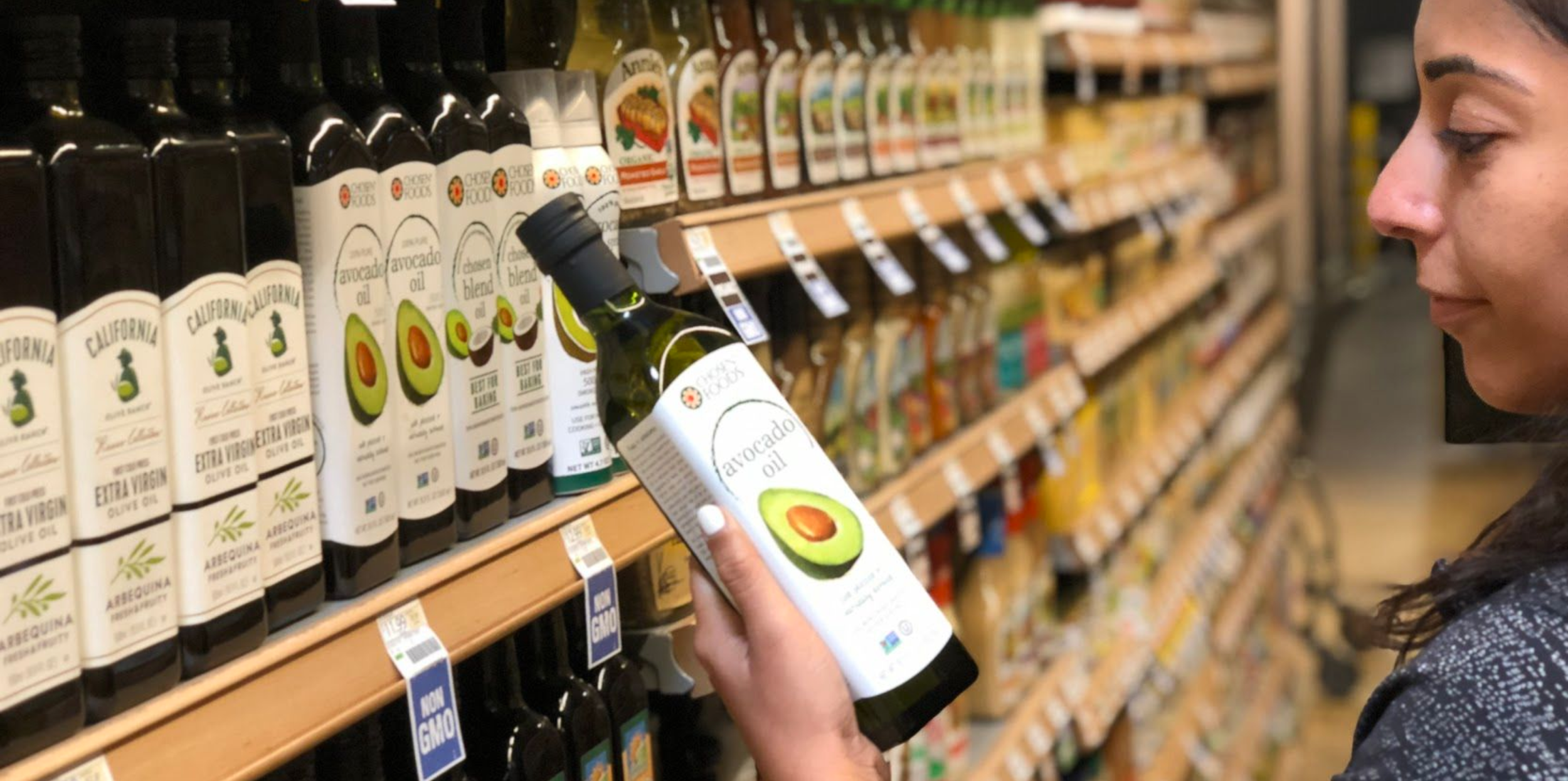
Shelf-Ready Packaging (SRP)

*Image Credit: Chosen Foods
Shelf-ready packaging is the best choice for those who want to save time, money, and resources when preparing a product for distribution.
And who doesn’t want to save all that?
SRP refers to containers with ready-to-sell products. Distributing these is easy: use the same shipping box from factory to retailer to consumer. The same shipping box will be used as display boxes in stores.
Juices and toothpastes are examples of these shelf-ready packaged products. Try to keep an eye out for them the next time you go to the store!
Overpackaging
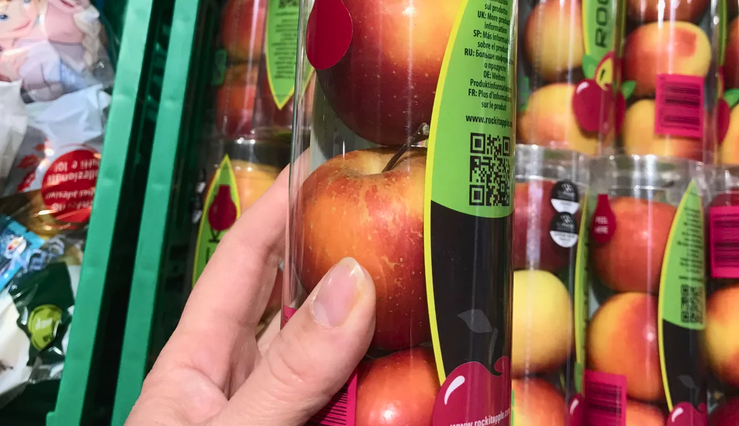
*Image Credit: Cake Mania
Overpackaging is when one adds layers of unnecessary packaging of a product. There are no sound logistical reasons for this practice— just drama.
However, it’s become popular for a reason. The world's biggest online shopping site, Amazon, has a prime example of overpackaging: think of all the times you have ordered a small package only to be greeted by a box twice (or thrice) its size.
That’s over packaging at work! Cut the waste, and ensure your packaging design is efficient.
Substrate
This is your design’s home!
The substrate is the material your design will be printed on.
The most common type of substrate is corrugated fiberboard, but other materials include carton, board, and polypropylene.
CMYK
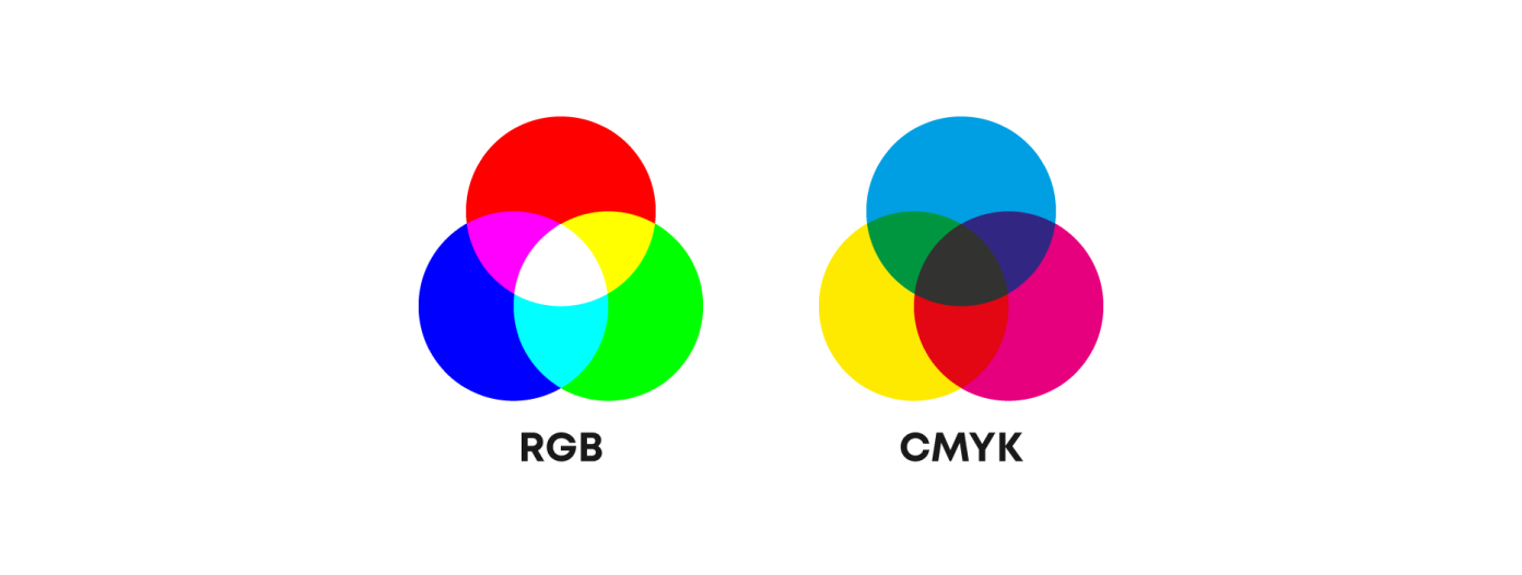
*Image credit: Webnial
If you’ve ever handled a printer before, you’ve probably seen this term already
CMYK is an abbreviation for Cyan, Magenta, Yellow, and Key (black).
It is used as the standard for color printing in the industry, and can sometimes refer to the process of printing itself.
The time you spend looking up packaging jargon or having miscommunications with your team could be used in efficient design and production sessions instead.
Learning these terms should be the least of your problems. Knowing them from the get-go means you can spend more time thinking about the other factors in your design process.
What other factors, you ask?
Well...
2 Questions to ask yourself when designing your packaging
Now that you know your basic packaging design terms, let’s jump back into the audience journey. Ask yourself:

1. Who are you designing for?
Each brand has their own target audience that they would like to connect with. While it is important to identify who your target market is, it is also critical to see who is the end-user for the product. Who is using the product? Who is making buying decisions?
Take this for example.
Baby food is meant for kids less than a year old, but you definitely won’t find 6-month-old shoppers making decisions in the grocery aisle.
The target audience would still be the moms and dads. So during the design process, be mindful about the end-user, but also design for the grocery store shopper who is ultimately making the buying decisions.
And because we want you to go above and beyond with your packaging design, here’s a wake up call for you!
Keep in mind that not all consumers look the same.
So consider differently abled consumers who benefit from innovative packaging. Would the cap open as easily with someone with different motor skills? Is your text still user-friendly for those who have visual impairments?
Creativity is not just limited to aesthetics, but also in coming up with ways to aid others!
2. What journey do you want to take them on?
Each journey has a beginning, middle, and end. Consider where your journey with your audience starts.
Where do they shop? How does your packaging draw them to your product?
If your brand is organic, for example, your packaging needs to look organic to attract your target audience from afar. If your brand is energetic and lively, it needs to look the part.
The middle: once the product is in their hands, how do they get from package to product? Consider the primary and secondary packaging we’ve tackled earlier, and decide depending on your brand’s values.
If your brand is a luxury product, you can amp up the experience by unraveling the product in a series of layers.
This all depends on your product. For example, no one wants to go through the same level of theatrics to get to a pack of bandages.
Most brands stop their journey once the consumer reaches the product, but we’re here to take you a step further.
Ask yourself: what happens to your packaging after it serves its purpose? Or even better— will it serve a new purpose after its initial use? Consumers nowadays consider brands who advocate sustainability, so you might want to include this aspect in your packaging design.
Your brand + your audience = your packaging design process!
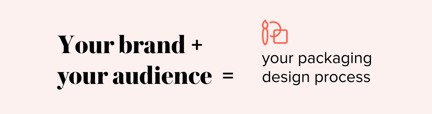
Your overall process should reflect your brand, your values, and those you want to reach. Here at Mindsy, we have an idea of the experience we want our consumers to have.
That customer journey is achieved through a good amount of planning, brainstorming, designing, testing, and a good grasp of the production process.
It may sound like a lot, but these steps will make sure that we are in control of the whole experience. Because that’s what good designers should do!
With these basic packaging terms and tips, you are well on your way to influencing your audience through design!
Ready to get started on your packaging design journey?
kick off your process with ideas on sustainable packaging, or spice things up with more insights through our packaging design course!
OR
Looking for a design studio to partner with? CONTACT US AND LEARN MORE.
branding | brand essence | packaging | packaging design | fast-moving consumer goods | packaging term